Packaging - Logo
Coats of arms, hallmarks, monograms…the logotype (or ‘logo’ for short) dates back to the rise of commercial society. The ‘brand’, born of the Industrial Revolution, adopts a typographic logotype identifying its manufacturer. Often accompanied by an abstract or figurative graphic image, the ‘logo’ is the common thread linking products from the same manufacturer and conveying its values and identity, just as, for example, the bird’s nest is associated with the Nestlé brand.
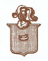
© Archives Historiques Nestlé - Henri Nestlé’s family coat of arms
Logotype, a symbolic combination of graphics
The heraldic coats of arms of the craftsmen’s guilds in the Middle Ages, goldsmiths’ and silversmiths’ hallmarks, monograms and initials, and the branding of livestock are all examples of making yourself recognisable or making your affiliation, property or creation recognisable as a way of highlighting your identity. The ‘logo’, for example, is a symbol that groups together a set of graphic characters to represent a brand or a company.
The term ‘logo’ is a shortened form of logotype and appeared in the 19th century, at the same time as legally protected trademarks. In typography language, it refers to a group of letters joined together to make a graphical composition. Nowadays, the logo is synonymous with a graphical composition which can include an image and/or text.
In an increasingly competitive environment, the ‘logo’ therefore connects different products from the same brand or the same company. It is an ambassador for corporate identity and values, and thereby lies at the root of all communication strategies.
The Nestlé logo: the nest
Logos are often accompanied by a figurative element which conveys identity, also known as the ‘emblem’. Nestlé’s logo, for example, represents a bird’s nest and was originally inspired by company founder Henri Nestlé’s family coat of arms: A bird sitting on its eggs in a nest.
This ‘logo’ is directly linked to the marketing of the farine lactée (infant milk) which earned the company its international reputation. Nestlé decided to customise this image to link it more closely to its product’s nutritional qualities, thus the nest became home to three fledglings and an adult bird feeding them. The founder’s name and that of his product became inseparable in 1875, with the creation of the business name ‘Farine lactée Henri Nestlé’. The family name turned into a trademark, protected in Switzerland from 1888 by the new federal law.
Over the years, this logo and its emblem have become formally simplified. When packaging was being designed, Henri Nestlé wanted identical labelling for every product that clearly displayed his family name as a guarantee of authenticity and quality, the product name and the emblem or bird’s nest. Identical He insisted on identical labelling for every country as well, as in 1868, he said, “I’m afraid I cannot agree to let you change my nest for a Swiss cross. The cross looks very good on the lid, but I absolutely insist that my labels must be identical everywhere; the external appearance must be the same, only the text being translated into the language of the country. People must be able to identify my product at first glance. The nest is not only my trademark but also my coat of arms. […] I cannot have a different trademark in each country. Anyone can use the cross, but nobody is entitled to use my coat of arms.” (Pfiffner, p.101, 2014).
PFIFFNER, Albert, 2014. Henri Nestlé 1814-1890. Bicentenaire. Vevey, Cham : Nestlé S.A.
URVOY, Jean-Jacques et FARDIN, Emmanuel, 2009. Créer un logotype. Paris : Eyrolles.
URVOY, Jean-Jacques, SANCHEZ-POUSSINEAU, Sophie et LE NAN, Erwan, 2012. Packaging. Toutes les étapes du concept au consommateur. Paris : Eyrolles.